모바일에서 읽기 위한 용도로만 복사해 오는 블로그

금요일, 3월 26, 2010

The Social Media Bubble

I'd like to advance a hypothesis: Despite all the excitement surrounding social media, the Internet isn't connecting us as much as we think it is. It's largely home to weak, artificial connections, what I call thin relationships.
During the subprime bubble, banks and brokers sold one another bad debt — debt that couldn't be made good on. Today, "social" media is trading in low-quality connections — linkages that are unlikely to yield meaningful, lasting relationships.

Call it relationship inflation.
 Nominally, you have a lot more relationships — but in reality, few, if any, are actually valuable. Just as currency inflation debases money, so social inflation debases relationships. The very word "relationship" is being cheapened. It used to mean someone you could count on. Today, it means someone you can swap bits with.
Thin relationships are the illusion of real relationships. Real relationships are patterns of mutual investment. I invest in you, you invest in me. Parents, kids, spouses — all are multiple digit investments, of time, money, knowledge, and attention. The "relationships" at the heart of the social bubble aren't real because they're not marked by mutual investment . At most, they're marked by a tiny chunk of information or attention here or there.
Here's what lends support to my hypothesis.
Trust. If we take social media at face value, the number of friends in the world has gone up a hundredfold. But have we seen an accompanying rise in trust? I'd argue no. Now, perhaps it will take time for gains to be visibly felt. But social networks have already been around for half a decade, and society seems to be little better off.
Disempowerment. If social tools were creating real economic gains, we'd expect to see a substitution effect. They'd replace — disintermediate — yesterday's gatekeepers. Yet, increasingly, they are empowering gatekeepers. Your favorite social networks aren't disintermediating PR agencies, recruiters, and other kinds of brokers. They're creating legions of new ones. The internet itself isn't disempowering government by giving voices to the traditionally voiceless; it's empowering authoritarian states to limit and circumscribe freedom by radically lowering the costs of surveillance and enforcement. So much for direct, unmediated relationships.
Hate. There's this old trope: the Internet runs on love. Equally, though, it's full of hate: irrational lashing-out at the nearest person, place, or thing that's just a little bit different. Read any newspaper web comments sections lately? Usually, they're giant puddles of bile and venom. Check out these emails to Floyd Norris. Far from fueling meaningful conversation, today's "social" web is a world full of the linguistic equivalent of drive-by shootings.
Exclusion. Hate happens, at least in part, because of homophily: birds of a feather flock together. The result is that people self-organize into groups of like for like. But rarely are the gaps between differences bridged. Yet, that's where the most valuable relationships begin. To be "friends" with 1000 people who are also obsessed with vintage 1960s glasses isn't friendship — it's just a single, solitary shared interest.
Value. The ultimate proof's in the pudding. If the "relationships" created on today's Internet were valuable, perhaps people (or advertisers) might pay for the opportunity to enjoy them. Yet, few, if any, do — anywhere, ever. Conversely, because those "relationships" aren't valuable, companies are, it is said, forced to try and monetize them in extractive, ethically questionable ways. That's because there's no there there. I can swap bits with pseudo-strangers at any number of sites. "Friends" like that are a commodity — not a valuable, unique good.
What are the wages of relationship inflation? Three cancers eating away at the vitality of today's web. First, attention isn't allocated efficiently; people discover less what they value than what everyone else likes, right this second. Second, people invest in low-quality content. Farmville ain't exactly Casablanca. Third, and most damaging, is the ongoing weakening of the Internet as a force for good. Not only is Farmville not Casablanca, it's not Kiva either. One of the seminal examples of the promise of social media, Kiva allocates micro-credit more meaningfully. By contrast, Farmville is largely socially useless. It doesn't make kids tangibly better off; it just makes advertisers better off.
Let's summarize. On the demand side, relationship inflation creates beauty contest effects, where, just as every judge votes for the contestant they think the others will like the best, people transmit what they think others want. On the supply side, relationship inflation creates popularity contest effects, where people (and artists) strive for immediate, visceral attention-grabs — instead of making awesome stuff.
The social isn't about beauty contests and popularity contests. They're a distortion, a caricature of the real thing. It's about trust, connection, and community. That's what there's too little of in today's mediascape, despite all the hoopla surrounding social tools. The promise of the Internet wasn't merely to inflate relationships, without adding depth, resonance, and meaning. It was to fundamentally rewire people, communities, civil society, business, and the state — through thicker, stronger, more meaningful relationships. That's where the future of media lies.
Now, this is just a hypothesis. Feel free to disagree with me, challenge me — or to extend and elaborate upon it. Next time, I'll discuss what we can do about it.

목요일, 3월 25, 2010

11 Ways to Use Twitter to Help Your Site Go Viral

How can Twitter be used to help spread the word of your website or blog? Today Jeff Printy, Creator ofWrite or Die (follow him @DrWicked.
Twitter is one of the most satisfying ways to spread your website or idea. In addition to referrals, you can also gain loyal users, expert opinions, and possibly friends. It’s unlike any other medium in its ability to propagate interesting things. Word of mouth has always been the best advertising and Twitter is the best vehicle on the internet for word of mouth.
use-twitter-to-go-viral.png
Here are some things you can do to get people Tweeting about your site.

1. Learn to explain the concept of your website in 140 characters or less.

Less than 100 characters if possible, to leave room for the URL. The second part of this is to pay attention after the launch not to just who is Tweeting, but how. If people are describing your site in a different way than you are, that give you a good idea of which parts they find useful. This is honesty that you cannot buy with market research.

2. When describing your site, leave something to the imagination.

Give Twitterers a reason to click and find out more. My tagline is “If you stop writing, there will be consequences,” that’s 46 characters, which leaves me more than enough room for the title of my site and the URL.

3. All of your target audience might not be on Twitter, but you can bet that their favorite bloggers are.

I’ve gotten a large amount of traffic directly from Twitter (almost a quarter of total traffic) but I credit Twitter for a great deal more than just those referrals. I managed to get featured on Lifehacker, Stumbleupon and the Delicious front page within 10 days of release, not because of some grand advertising push from my end, but because people were Tweeting about Write or Die. The very top echelon of internet-savvy people use Twitter, and those are the people you want to reach. You can’t afford not to.

4. Tweet This… is your friend.

There has been a lot of talk lately about Twitterrank.com and their questionable requirement that you enter your username and password in order to Tweet your Twitterrank. The author would have avoided all of the bad press if he’d instead used a simple link. That way people could see what they’re Tweeting and edit it if need be.
I used this on Write or Die. When people click “Tweet my results” they are taken to their Twitter homepage and their status is filled in with “I Wrote X words in Y Minutes with Write or Die!

5. Make your Twitter ID the same or similar to the the name of your site.

When Write or Die first launched, I was still using another nickname as my ID, I’m very glad I switched it to DrWicked. It has helped me build my brand and gives me some authority when I respond to user issues.

6. Put a Follow Me on Twitter link in a prominent place on your page.

Having Twitter followers is a much better way to get loyalty. It’s a lot more personal than RSS, if I could convert all my RSS subscribers into Twitter followers, I would.

7. Design your Twitter homepage to closely mimic the design of your site.

I use the same background and a similar color scheme to achieve this. It gives your followers a sense of continuity. Consider adding additional details about your site to the background image to give people even more of an insight.

8. Turn on “Show me all @ Replies,” so your new Twitter followers can contact you with questions (or praise).

If you use Twitter mainly as a messaging system within your network of friends, get another account. Twitter has been of inestimable value in quickly addressing user issues. It’s just over two weeks old and in those two weeks there’s been a major update and it’s only been broken for one hour.

9. Use TinyURL’s Custom Alias feature to further reinforce your brand.

10. Use search.twitter.com to monitor your site’s health in the wild.

  • Search for your site’s name, so you see people who are mentioning your site and using URL shortening services. If this returns unrelated results, try appending filter:link to your search.
  • Search for your URL so you can see who’s linking to you.
  • Search for new customers, search for people who are Tweeting about the problem your site solves, I searched for “behind word count” (without quotes) and found a perfect demographic.
Subscribe to all of these in your RSS reader. Not only is it great to see people talking about your site, you can also address problems the moment they are up for discussion.

11. Even if your Twitter account isn’t personal, keep it personable. Do Not Spam.

No one wants to follow someone who is just pimping their own creation all day every day, that’s the fastest way to lose followers. If they’re following you, they don’t need pimping to, they’re already your users. One of the chief delights of Twitter is how it allows people a glimpse into the lives of others distant from them.
Tell users about useful updates to your site. Let them rejoice with you if you get featured on a major site, but don’t let that be the only thing you’re tweeting about. After all, the Mars rover didn’t get all those followers because it was pimping for NASA funding.

수요일, 3월 24, 2010

20대는 왜 투표하지 않게 되었나

    
20대는 왜 투표하지 않게 되었나
[특집] 계급과 투표의 고차방정식
[18호] 2010년 03월 05일 (금) 18:30:21엄기호  info@ilemonde.com
속물주의, 탈정치화 아닌 정치적 계몽의 산물
좌파 언어 탁월해져야 세대의 계급화 가능
 세대는 계급을 대체했는가? 요즘 사회과학에서 유행하는 담론을 찾아본다면 확실히 세대는 계급을 대체한 듯이 보인다. ‘88만원 세대’라는 담론은 고용 없는 성장의 시대에 비정규직이나 실업이 삶의 양식이 되어버린 한 세대 전체의 운명을 적나라하게 상징하고 있다. 마치 한 세대 전체 혹은 절대다수가 ‘잉여인간’이라는 동일한 운명 공동체가 되어버린 듯한 강렬한 인상을 불러일으킨다. 현실 투쟁에서도 계급을 대체하는 듯한 세대 담론이 가진 물리적인 힘은 세계 곳곳에서 검증되고 있다. 2006년 프랑스 청년들의 대규모 노동법 개악 반대 시위에서부터 2008년 그리스의 반정부 시위는 명백하게 청년층이 주도했으며 시위의 주제 또한 청년실업과 직결됐다. 서구만이 아니라 아시아에서도 이 징후는 나타나고 있다. 얼마 전 홍콩의 거리에 갑자기 나타나, 중국 본토와 연결하는 초고속열차 때문에 삶터에서 쫓겨나는 사람들과의 강력한 연대를 주장하며 비타협적 시위를 주도한 것도 ‘80년후’ 세대라고 불리던 청년들이었다. 이렇게 본다면 적대의 전선이 분명히 노동과 자본 사이에서 세대의 문제로 전이된 것처럼 보인다.
 세대는 저절로 투표하지 않아
  
▲ <한겨레21> 김정효 기자
그러나 ‘88만원 세대’라는 말이 흔히 불러일으키는 오해처럼 경제적 영역에서 세대가 계급을 대체한 것이 아니다. 오히려 경제 영역에서 ‘노동 없는 가치 창출’ 혹은 ‘노동의 일회성화’라는 자본 축적 방식의 변화에 따라 한 세대 전체가 졸지에 노동의 영역 바깥으로 추방될 위기에 봉착함으로써, 적대 전선이 자본과 조직화될 수도 없는 잠재적 노동으로서 청년 세대 사이의 문제로 전환한 것이다. 문제는 이 경제적 적대가 바로 정치적 투쟁으로 직결되지 않는다는 점이다. 계급이 자동적으로 투표하지 않는 것처럼 세대도 저절로 투표하지 않는다. 단적인 예가 한국의 20대다. 지난 촛불 시위에서도 고등학생까지 거리에 뛰쳐나오는데 왜 20대와 대학생들은 보이지 않느냐는 말이 많았다. 이 때문에 20대에 대한 고전적 탈정치화론에서부터 보수화론까지 엄청난 비판이 쏟아졌다. 20대들은 자신이 언제든 잉여인간의 나락으로 떨어질지 모른다는 것을 잘 알고 있다. 그러나 이것이 곧 프랑스나 그리스, 홍콩에서처럼 사회구조에 대한 저항으로 나타나지는 않는다. 오히려 88만원 세대론이 보수주의 언론에 의해 왜곡되어 쓰이는 것처럼 자본과 세대 간의 적대가 세대 ‘간’의 대립으로 전환되어 나타날 수 있다. 이때 작용하는 것이 ‘문화’이다. 경제는 문화를 관통할 때만 정치가 된다. 따라서 우리가 들여다봐야 하는 것은 88만원 세대가 처한 삶의 조건이 만들어내는 인간과 세상에 대한 감각이다. 세대가 계급을 대체한 것이 아니라 세대가 계급을 사유하고/사유하지 못하도록 하는 세상과 인간에 대한 감각이 만들어진 것이다. 스펙터클의 사회와 신자유주의를 거치면서 지금의 20대가 인간의 본성이라고 이해하는 것은 ‘속물’이다. 그리고 이 ‘속물’들이 도덕적으로 살아남기 위해 취하는 세상에 대한 태도는 ‘냉소주의’인 것이다. 인간 모두가 속물인 사회에서 무한경쟁은 인간의 숙명이 되어버린다. 만약 무한경쟁이 인간의 본성이며 운명이라고 한다면 그에 저항하는 것은 무의미하다. 이를 반대하는 이른바 ‘가치’라는 것은 냉소의 대상이 될 뿐이다. 
대학생이 인간과 사회의 변화에 대해 어떤 태도를 가지고 있는지를 적나라하게 보여주는 사례가 있다. 지난 학기에 강의를 하던 한 대학에서 학생들과 함께 본 <브이 포 벤데타>라는 영화에 대한 토론에서였다. 이 영화에서 국가는 미디어를 완전히 장악하고 진실을 왜곡하며 국민을 바보로 만들어 통치하려고 한다. 이런 통치는 언제나 완벽할 수 없으며 진실은 누군가를 통해서 밝혀지며 우매한 것처럼 보이는 대중은 진실에 감응되고 행동에 나서게 된다. 그런데 의외로 이 영화의 메시지에 대해 학생들의 반응은 냉소적이었다. 그중에서 가장 인상적인 것은 한 학생이 만든 엔딩 크레디트 이후의 시나리오였다. 독재의 붕괴 이후 민주정부가 곧 들어서지만 정책적 무능으로 사회는 큰 혼란에 빠진다. 때맞춰 미디어에서는 독재를 종식시키는 데 결정적 공헌을 한 ‘브이’라는 영웅의 사생활을 캐고 온갖 스캔들을 경쟁적으로 보도한다. 혼란을 틈타 종적을 감춘 것처럼 보였던 보수주의자들이 다시 세력을 규합하고 대중 사이에서 정치적 선동을 일삼는다. 결국 사회는 제자리로 돌아간다.
이 학생의 주장에서 만나게 된 것은 탈정치화가 아니라 정치에 대한 지나친 계몽이다. 이 세대는 정치를 모르는 것이 아니라 너무 많은 것을 알고 있어서 정치에 냉소적인 것이 문제였다. 이들은 정치에 대해 아무런 환상을 가지고 있지 않았다. 그리고 변화라는 것이 어떤 실체적 변화를 이끌어낸다는 것에 냉소했다. 진보니 보수니 싸우는 사람들은 자신이 대단히 큰 차이를 가지고 있는 것처럼 말하지만 보는 사람 입장에서는 그놈이 그놈인 상황이며, 어느 놈이 되더라도 내 삶이 별로 달라지지 않을 것이라는 통찰이었다. 독일의 문제적 철학자 슬로터다이크의 논법을 따르자면 이들은 정치적으로 미각성한 것이 아니라 지나치게 정치에 대해 계몽된 존재인 셈이다. 이들은 정치를 너무 잘 알아서 정치에 무감각해졌고 모든 가치에 대해 냉소적이 되었다. 이런 상황에서는 냉소주의만이 현실에 대처할 수 있는 유일무이한 기본 장비(1)가 되는 셈이다. 냉소적 주체들은 절대적 가치라는 것이 존재하지 않으며 모든 새로운 가치가 단명한다는 것을 잘 알고 있다. 바로 도덕의 냉소주의가 만들어내는 속물의 정치이다. 가치의 종식 속에서 살아가는 존재가 바로 속물이 아닌가? 바로 여기에 이명박이 집권할 수 있었던 이유가 있다. 이명박을 지지한 20대 대부분은 그가 새로운 가치를 제시해서 지지한 것이 아님을 너무 잘 알고 있다. 그들은 이명박 대통령이 가치를 이야기하면 오히려 냉소한다.
 속물인가, 속물이 돼야만 하는가
실로 우리는 속물들의 시대를 살아가고 있다. 지금 미디어에서 성공하고 있는  드라마와 예능 프로그램은 대부분 우리가 얼마나 속물인가를 과장해 까발리는 내용이다. 얼마 전까지 선풍적 인기를 끌어모은 tvN의 <재밌는 TV 롤러코스터>를 생각해보자. 남성의 전형으로 나오는 정형돈은 쉽게 말하면 찌질이 혹은 진상이다. 머리에 든 것이라고는 예쁜 여자와 축구뿐이며 나머지에 대해서는 귀찮아할 뿐이고 제대로 일처리를 하는 것 하나 없다. 이에 반해 여성의 전형으로 제시된 정가은은 생각하는 것이라곤 오로지 멍청한 남자친구를 여우 짓을 통해 후려 처먹는 것이나 남에게 과시하기 위한 ‘명품백’밖에 없는 된장녀다. <개그콘서트>에서 인기를 끌고 있는 ‘남성인권보장위원회’나 리얼리티쇼를 표방하는 대부분의 예능 프로그램은 이 연장선상에 있다. 우리 모두는 속물인 것이다.
그러나 이 속물주의의 이면에서 발견하는 것은 20대들의 살아남기 위한 처절한 생존 노력이다. 역설적으로 속물이 되어야지만 살아남을 수 있는 시대다. 우리는 누군가 자신의 허벅지를 음흉한 시선으로 바라보며 ‘꿀벅지’라고 불렀을 때 자신의 존엄이 침해되었다고 항의할 권리가 없다. 오히려 이런 호명은 자신이 이 사회에서 상품으로서 가치를 인정받는 영광스러운 일로 여겨야 한다. 상품으로 인정받지 못하는 순간에 자신은 사회에서 아무런 가치도 인정받지 못하는 쓰레기로 전락하기 때문이다. 그래서 ‘꿀벅지’에 이어 ‘말벅지’가 등장했다. 송일국은 한 인터뷰에서 자신의 ‘말벅지’를 보여주어야 하는데 하며 아쉬워했다. 내 스스로 어떤 가치가 있는지를 드러내고 스펙터클로 치장해야 한다. 스펙터클의 바깥은 없다. 심지어 이번 중학생들의 졸업식 알몸 사건처럼 내가 남을 때리는 것조차도 인터넷에 올려 자랑을 해야 한다. 누군가에게 끊임없이 나를 보여주어야 한다. 이런 관점에서 본다면 우리 모두는 속물인 것이 아니라 속물이 되어야 하는 것이다.
이것이 한국 좌파가 가장 패착하고 있는 부분이다. 한국의 좌파들은 인간과 사회에 대한 상식의 싸움에서 보수주의자들에게 지고 있다. 이 문화 전쟁에서 실패한다면 그 결과가 어떠할지를 적나라하게 보여주는 것이 영국의 사례다. 1972년 11월 5일 영국 버밍엄의 빈민가 핸즈워스에서 유색인종 청소년 3명이  백인 노동자 1명을 구타하고 돈을 빼앗는 사건이 있었다. 이는 언론에서 ‘강도 사건’으로 대서특필되었다. 보수주의자들은 이 사건을 통해 영국이 도덕적 위기에 빠졌으며 법과 질서의 재정립이 필요하다는 것을 극적으로 부각시켰다. 질서의 적은 바로 이주노동자였으며 어른들이 이해하지 못하는 옷차림과 언어를 즐기는 청소년이었다. 위기를 관리하지 못하는 노동당의 무능이 고발되었다. 한편 미조직 노동자를 중심으로 다수의 노동자가 노동조합 상층 간부들이 장악한 노동당에 등을 돌렸다. 대신 그들은 국가를 도덕적 위기에서 구할 수 있는 대처주의의 언어에 동의했다. 이것이 영국에서 전후의 합의에 바탕을 둔 조합주의적 정치가 강압적인 법과 질서 중심의 대처주의로 넘어가는 배경이었다. 노동당은 투표에서 진 것이 아니라 인간과 사회에 대한 상식의 싸움에서 대처에게 진 것이다.
 여기가 우리의 로두스다 현재 한국의 상황은 이때의 영국과 별반 다르지 않다. 지금 좌파들이 구사하는 대다수 언어는 세상과 인간에 대한 ‘진리’를 알아버린 20대에게는 냉소주의만을 더 강화하는 진부한 성명서 언어만을 반복하는 패착에 빠져 있다. 한국 좌파의 언어에는 정치에 지나치게 계몽된 지금 20대의 냉소적 앎을 압도할 수 있는 ‘탁월함’이 없다. 온라인이건 오프라인이건 진보 정당이나 노동조합, 시민단체의 모임과 뒤풀이는 여전히 80년대의 계보학과 ‘깔대기 이론’으로 사람을 녹다운시키고 있다. 탁월함. 이것이 속물과 냉소주의를 뛰어넘을 수 있는 핵심어다. 희망은 이 20대가 여전히 탁월함에 대해서 감동받고 영감을 얻는다는 사실이다. 김연아를 능가하는 스펙터클로서의 탁월함만을 말하는 것이 아니다. 일상과 삶의 가치에 대한 탁월함은 사이버공간의 웹툰이나 아고라같이 고전적 좌파들이 거의 돌아보지 않는 곳에서 동시다발적으로 발생하고 있다. 20대가 ‘계급’과 단절된 것이 아니라 ‘고전적 좌파’의 언어가 20대와 단절된 것이다. 속물주의와 냉소주의에 맞서는 좌파의 탁월한 언어가 필요하다. 좌파끼리 만나는 성명성의 언어가 아니라 좌파와 대중, 특히 20대와 만나는 좌파의 상식에 대한 언어, 그것이 우리의 로두스이다. 여기서 뛰어야 한다.
글•엄기호 연세대 문화학과 박사과정 수료. 우리신학연구소와 인권연구소 창 등에서 활동하고 있다. <닥쳐라, 세계화>(당대·2008), <아무도 남을 돌보지 마라>(낮은산·2009) 등을 썼다. 
<각주>(1) 슬로터다이크의 <인간농장을 위한 규칙>에 대한 이진우의 발문 19~20쪽 참조.

화요일, 3월 23, 2010

Scrolling and Attention

Summary:
Web users spend 80% of their time looking at information above the page fold. Although users do scroll, they allocate only 20% of their attention below the fold.
In Web design, there's much confusion about the "page fold" concept and the importance of keeping the most salient information within a page's initially viewable area. (That is, in fact, the definition: "above the fold" simply means "viewable without further action.")
During the Web's first years, users often didn't scroll Web pages at all. They simply looked at the visible information and used it to determine whether to stay or leave. Thus, in usability studies during that period (1994–1996), sites often failed if they placed important information below the fold as most users didn't see it.
This reluctance to scroll made sense at the time, because people were used to having computers show all their choices. Dialog boxes, CD-ROM multimedia shows, and HyperCard stacks all worked that way, and didn't require scrolling. (Although users sometimes encountered scrolling text fields, they didn't need scrolling to see the commands and options, and could thus make all decisions from the visible info.)
In 1997, however, I retracted the guideline to avoid scrolling pages because users had acclimated to scrolling on the Web. This was a rare case in which usability guidelines changed quickly. Typically, usability findings are stable across many years: 80% of Web usability guidelines from the 1990s are still in force.
Today, users will scroll. However, you shouldn't ignore the fold and create endless pages for two reasons:
  • Long pages continue to be problematic because of users' limited attention span. People prefer sites that get to the point and let them get things done quickly. Besides the basic reluctance to read more words, scrolling is extra work.
  • The real estate above the fold is more valuable than stuff below the fold for attracting and keeping users' attention.
So, yes, you can put information below the fold rather than limit yourself to bite-sized pages.
In fact, if you have a long article, it's better to present it as one scrolling canvas than to split it across multiple pageviews. Scrolling beats paging because it's easier for users to simply keep going down the page than it is to decide whether or not to click through for the next page of a fragmented article. (Saying that scrolling is easier obviously assumes a design that follows theguidelines for scrollbars and such.)
But no, the fact that users scroll doesn't free you from prioritizing and making sure that anything truly important remains above the fold.
Information foraging theory says that people decide whether to continue along a path (including scrolling path down a page) based on the current content's information scent. In other words, users will scroll below the fold only if the information above it makes them believe the rest of the page will be valuable.

Eyetracking Data

Last month, we conducted a broad eyetracking study of user behavior across a wide variety of sites. To investigate whether the "fold" continues to be relevant, I analyzed parts of the study with a total of 57,453 fixations (instances when users look at something on a page, typically for less than half a second).
To avoid bias, I only analyzed data from 21 users accessing 541 different Web pages, even though our full study was much larger. To convince you that I didn't limit the data for nefarious reasons, let me explain why I excluded some parts of the study from the present analysis.
Because our research goal was to generate fresh insights for our annual conference seminars, we targeted large parts of the study to test:
For each specialized topic, it's perfectly valid to target a study and test sites that have features that we want to investigate. For example, to gain insight into carrousels for our navigation seminar, we should track users' eyes as they encounter carrousels. To do this, we simply ask them to use a site that happens to include a carrousel, but we don't draw their attention to that design element.
When we deliberately ask people to test sites that contain particular design elements, we can't conclude that their behavior is representative for average sites. Sticking with the carrousel example, people might well scroll less often than normal if the carrousel successfully keeps their attention on the upper part of the page.
Our study also featured a component that let users go to any site they wanted, for the sake of our broad-ranging seminar on Fundamental Guidelines for Web Usability. These non-constrained tasks are the source of the data I'm analyzing here, because they tested the regular websites people use, as opposed to sites we picked for their design features.

Attention Focused at the Top

The following chart shows the distribution of user fixations along stripes that were 100 pixels tall. The bars represent total gaze time, as opposed to the number of fixations. (In other words, two fixations of 200 ms count the same as one fixation of 400 ms.)
Bar chart of the distribution of gaze duration for Web page areas 100 pixels tall, starting at the top
Even though 5% of users' total time is spent past the 2,000-pixel mark, they tend to scan information that far from the top fairly superficially: some pages are very long (often 4,000+ pixels in my sample), and thus this 5% of user attention is spread very thinly.
In our study, user viewing time was distributed as follows:
  • Above the fold: 80.3%
  • Below the fold: 19.7%
We used an eyetracker with a resolution of 1,024 × 768 pixels. These days, many users have somewhat bigger screens, and we've conducted many (non-ET) usability studies with larger resolutions. Although using a bigger monitor wouldn't change my conclusions, it would somewhat increase the percentage of user attention spent above the fold simply because more info would be available in the initially viewable space.

Scrolling Behaviors

Sometimes, users do read down an entire page. It does happen. Rarely.
More commonly, we see one of the two behaviors illustrated in the following gaze plots:
Gaze plots of viewing behaviors on three very long pages that all were scrolled almost to the bottom.
Gaze plots showing where three users looked while visiting pages during three different tasks (one test participant per page). Each blue dot represents one fixation, with bigger dots indicating longer viewing time.
On the left, the user scrolled very far down the page and suddenly came across an interesting item. This viewing pattern gives us many fixations that are deep below the fold. We often see this pattern for well-designed FAQs, though the best FAQs present the most frequently asked questions at the top (so that many users won't need much scrolling).
The left gaze plot also illustrates another point: the last element in a list often attracts additional attention. The first few items are definitely the most important, but the final item gets more views than the one before it. (That's also why the bar chart shows more attention to the 701–800 pixel area than to the 601–700 pixel area: the bottom of our study monitor fell within the former area.) The end of a list's importance is further enhanced by the recency effect, which says that the last thing a person sees remains particularly salient in the mind. (We discuss the design implications of the recency and primacy effects in our seminar on The Human Mind and Usability.)
The two other gaze plots show more common scrolling behaviors: intense viewing of the top of the page, moderate viewing of the middle, and fairly superficial viewing of the bottom. (I picked examples where users scrolled more or less all the way down — often there's no viewing of the bottom because users don't scroll that far.)
It's as if users arrive at a page with a certain amount of fuel in their tanks. As they "drive" down the page, they use up gas, and sooner or later they run dry. The amount of gas in the tank will vary, depending on each user's inherent motivation and interest in each page's specific topic. Also, the "gasoline" might evaporate or be topped up if content down the page is less or more relevant than the user expected.
In any case, user attention eventually peters out, and the further down the page users go, the less time they generally spend on each additional information unit.
The middle gaze plot shows a category page with 50 sofas:
  • The top 2 rows get about 5–10 fixations per sofa.
  • The next 4 rows get around 2–4 fixations per sofa.
  • The next 8 rows typically get 1 fixation per sofa.
  • The bottom 3 rows get 2 fixations for one sofa and no fixations for the remaining 7 sofas.
This is only a rough pattern, and users will deviate depending on the content. For example, the Cameon Loveseat and the Custom Hugo Loveseat both get 4 fixations despite being 2,750 pixels down the page. Presumably, the user found these two sofas particularly appealing.

Design Implications

The implications are clear: the material that's the most important for the users' goals or your business goals should be above the fold. Users do look below the fold, but not nearly as much as they look above the fold.
People will look very far down a page if (a) the layout encourages scanning, and (b) the initially viewable information makes them believe that it will be worth their time to scroll.
Finally, while placing the most important stuff on top, don't forget to put a nice morsel at the very bottom.

Learn More

My next column will look at the horizontal distribution of user attention across the page.
Full-day seminars on:
Presented at the annual Usability Week conference. (Topics differ by city, so check your preferred location's agenda for an exact list of seminars.)

토요일, 3월 20, 2010

12 Reasons To Be Learning Graph Theory


Andrés Osinski

Courtesy of Matt Britt
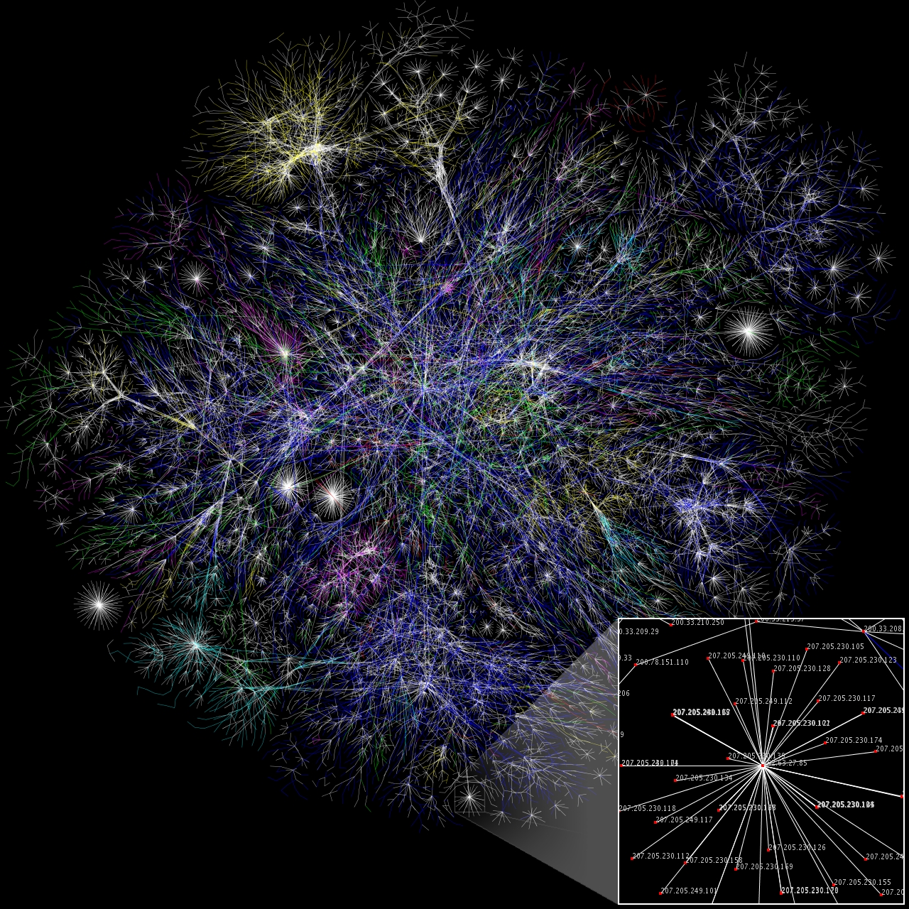
Throughout our schooling we always encounter some topics that we feel very strongly about, either because of how fascinating they are or how tediously boring or difficult they may be. Graph Theory is one of those controversial topics CS students will always be opinionated in; you either love it and are fascinated by its utility and applications, or you're appalled by the uselessness of the topic in your career. And let's be honest: when was the last time you actually, honestly had to work with graphs in a serious manner?
Even if you're lucky enough to never need to apply Graph Theory for what you do (which is actually the case with the majority of CS graduates), it's in the interest of everyone who wants to spend 4-6 years of their life dedicated to the study of computing and come out of the experience as a well-rounded professional. Now, you ask, what's so specially important that I should mind spending the next six months trying to wrap my head around these concepts and complete some of the most difficult coursework available? Here's just a few of the topics where this knowledge applies:

  • PageRank: the algorithm behind Google. Indexes pages and content as graphs, with edges representing cross-references. There's probably several properties each node and edge has, but that's the basics.
  • Pathfinding: Finding a path from one place to the other. Nodes represent forks in a road. Edges represent roads. Each edge is weighted with its distances or approximate traveling time. If a road is unidirectional, the edge is directed. After this, a sort of shortest-path algorithm or heuristic is applied ( Dijkstra's,Bellman-Ford, Floyd, etc). This is used everywhere, from industrial control systems, GPS units, optimization, etc.
  • Optimal traffic distribution in a network: A bunch of data on a network (be it a computer network or anything that can be represented analogously) is given a source node and a destination node. Each node in the network represents a network device. Each edge represents a connection. Each edge has a weight, which determines the maximum amount of content it can carry (capacity). From there, you can apply the a series of flow algorithms to determine the optimal distribution of data you're sending between all the possible nodes it can traverse. Used for routing algorithms.
    It should be noted that that's the naive version of the problem. In real life this gets tremendously complicated, as you have to deal with several flows, each vying for the same capacity.
  • Compiler optimization: A CPU has a limited number of registers where it can store its data, which is the quickest way to access it. Given a certain number of variables used in a program, you need to find a way to allocate variables in registers so as to maximize the use of the registers and minimize access to memory. This is solved through graph coloring, assigning each node/variable a "color", such that two adjacent nodes (variables used at the same time in a program) do not have the same color. This is an NP-complete problem, so you need to know that no optimal solution can be found in a reasonable time for large problems.
  • Finding locations of distribution centers: say you need to supply a city with some service. You need to select certain places so that you can cover the whole city with an adequate supply of goods without using more centers than necessary by a certain margin. This relates to the Maximum Weight Independent Set problem, the Maximum Clique problemvertex covering, andMaximum Independent Set problem.
  • Chemical interactions: Atoms and their bindings in molecules are clearly modeled as graphs. For more complex models it's insufficient to represent a molecule as a graph, but it is a significant part of the modeling component.
  • Scheduling: You have a conference center with a certain number of rooms, and different courses/presentations are assigned. Allocate all the presentations so that the schedules do not overlap, maximizing the usage of the conference rooms, and minimizing the duration of each conference by packing related courses as near as possible without overlap. This is actually an extremely difficult problem.
  • Optimum distributions paths: You need to distribute the mail to every house in a town, minimizing the number of trucks you use and making sure the trucks take the necessary routes and no more. This is a classing problem with Eulerian and Hamiltonian cycles; Traveling Salesmanor Chinese Postman problem.
  • Project Management: A PERT graph is a type of directed graph used for project management. It's a fairly universal tool for determining the dependencies and times for the completion of a project. The Critical path algoritm is applied to determine the shortest possible time a project can be completed in while meeting all its dependencies.
  • Program analysis: Several program analysis techniques used for determining the types of variables, compiler warning and errors, null-dereferencing bugs and variable optimization techniques can be utilized by describing a program as a series of graphs. One examples is thecontrol flow graph. Although from computability theory you should know that the Halting Problemmeans that you can't determine if every program can terminate, in practice using the Invariant Theorem you can see if most sorts of problems terminate. How do you reference the life cycle of variables, control structures, and data dependencies? You guessed it!

    A simple call graph
  • Package management and dependency management: In any serious operating system, packages have dependencies on each other, such as Firefox depending on GTK, glibc, etc. Nodes: packages: Edges: dependencies.
  • Circuit board layout: The layout of circuits can be described as a graph where components are nodes and electrical lines are edges. Now, you can't draw arbitrary lines through a circuit board, and not all layouts are optimal. Ideally, you want a planar layout where you can draw the lines without them criss-crossing. This is the Graph Planarity problem. Metarecursively speaking, you also need to apply the planarity problem to draw graphs in in a sheet of paper in a way that can easily understoof by a human reader; a graphical representation of a graph is completely arbitrary and unrelated to the graph's actual structure.

And this is just the tip of the iceberg. Any mildly interesting computer problem can be described with graphs. Combine graph theory with linear programming and numerical methods and you've got Operations Research, one of the most interesting (and lucrative) branches of applied mathematics. Knowledge in graph theory is generally a deal-breaker when getting a job in software research or any sort of intersting position that involves solving difficult problems. It's essential for working in research postions at Google, IBM, and other technology companies. Knowledge in Operations Research and Combinatorial Opimization is essential for industrial processes of any kind, and it's helped to create and destroy entire companies (shipping and logistics companies, for example, depend on it completely to lower costs and operate efficiently). A lot of hard research in social interaction is modeled with graphs, etc.
This could go on and on, but suffice to say that these examples should convince you of just how relavant, current and important Graph Theory is for our professions, whether we work directly with it creating new technologies, or silently working for us in the background, day after day.

목요일, 3월 18, 2010

Why you only need to test with five users

One question I get a lot is, Do you really only need to test with 5 users? There are a lot of strong opinions about the magic number 5 in usability testing and much has been written about it (e.g. see Lewis 2006PDF). As you can imagine there isn't a fixed number of users that will always be the right number (us quantitative folks love to say that) but testing with five users may be all you need for discovering problems in an interface, given some conditions.

The five user number comes from the number of users you would need to detect approximately 85% of the problems in an interface, given that the probability a user would encounter a problem is about 31%. Most people either leave off the last part or are not sure what it means.  This does not apply to all testing situations such as comparing two products or when trying to get a precise measure of task times or completion rates but to discovering problems with an interface. Where does 31% come from?  It was found as an average problem frequency from several studies (more on this below).
5 users only applies to discovering problems, not comparing interfaces or estimating a task time or completion rate.
For example, the calendar on Hertz.com has a problem with the dates. Let's imagine that this will adversely affect 31% of reservations—which is quite a lot. So the question becomes, if a problem occurs this frequently (affects this many users) how many users do you need to observe to have an 85% chance of seeing it during a usability test?  You might be tempted to think you only need 3 to see it once, but chance fluctuations don't quite work that way at small sample sizes. You actually would need 5, and this comes from the binomial probability.
The formulas actually work quite well, but math tends to bring back bad memories for many people so I've provided some simulations below to show you how it works.

Tossing a Coin (50% Probability)

We all know that there is a 50% chance of getting a tails and 50% chance of getting heads when flipping a coin. If you wanted to know how many times you should plan on flipping a coin to see tails at least once, using the binomial formula the answer is 3. You can see this for yourself; click the flip 1 coin until you see tails. 85% of the time you'll need to click it no more than three times. You can repeat this exercise and see the number of sample sizes which take more than 3. Over time, a bit more than 85% of all your samples will be 3 or less. 

Q: How many times do you need to toss a coin to be 85% sure you'll see tails at least once? 
A: 3 or fewer
On every button click there is a 50% chance you'll see tails.
Sample Sizes :

Rolling a Die (16.7% Probability)

There is a 1/6 chance of getting any number from a 6-sided die. So on any toss there is a 16.667% chance of getting a 1. The binomial formula predicts that you'd need to toss a die on average 10 times to be 85% sure you'll see a 1. 

Q: How many times do you need to toss a die to be 85% sure you'll see a one at least once? 
A: 10 or fewer
On every button click there is a 16.667% chance you'll see a one.
Sample Sizes :


UI Problems

Now I have three UI problems which occur 31%, 10% and 1% of the time. Every time you click "Test 1 User" it's like testing a user (but without the expenses!).

Detecting Problems that affect 31% of users

Q:How many users do you have to test to be 85% sure you'll see a problem that affects 31% of users at least once? 
A: 5 or fewer
On every button click there is a 31% chance you'll see a UI Problem.
Sample Sizes :

Detecting Problems that affect 10% of users

Q: How many users do you have to test to be 85% sure you'll see a problem that affects 10% of users at least once? 
A: 18 or fewer
On every button click there is a 10% chance you'll see a UI Problem.
Sample Sizes :

Detecting Problems that affect 1% of users

Q: How many users do you have to test to be 85% sure you'll see a problem that affects 1% of users at least once? 
A: 189 or fewer
On every button click there is a 1% chance you'll see a UI Problem.
Sample Sizes :


How many users do I need, then?

Of course not all problems affect 31% of users. In fact, in released software or websites, the likelihood of encountering a problem might be closer to 10% or 5%.  When problems are much less likely to be "detected" by users interacting with the software, you need more users to test to have a decent chance of observing them in a usability test. For example, given a problem only affecting 10% of users, you need to plan on testing 18 to have an 85% chance of seeing it once.  I've graphed the differences in the figure below. The blue line shows problems affecting 10% of users and the red affects 31% of users.
So if you plan on testing with five users, know that you're not likely to see most problems, you just likely to see most problems that affect 31%-100% for this population and set of tasks.


 Figure 1:  Difference in sample sizes needed to have an 85% chance of detecting a problem that affects 10% of users vs.  31% of users. You would need to plan on testing 18 users to have an 85% chance of detecting problems that affect 10% of users.

Why the controversy?

There's no concern about the binomial formula (or Poisson equivalent), the controversy is around how frequently UI problems really occur. In reality they aren't a fixed percent like 31% or 10%, instead these represent an average of problem frequency.
Problems don't uniformly affect users. 31% is an average frequency from many studies, for already released applications the frequency is probably less than 10%.
Problems in fact do not uniformly affect users, or affect users in an easily predictable way. While it is difficult to know how frequently problems occur, as a general rule, for early designs it will be higher (31% or more) and for applications that are in use with many users it will likely be below 10%. Of course you don't know what the probability a user will encounter a problem. In fact, you often don't even know if there is a problem—if you did you'd fix it!

As a strategy, pick some percentage of problem occurrence, say 20%, and likelihood of discovery, say 85%, which would mean you'd need to plan on testing 9 users. After testing 9 users, you'd know you've seen most of the problems that affect 20% or more of the users.  If you need to be surer of the findings, then increase the likelihood of discovery, for example, to 95%. Doing so would increase your required sample size to 13.

The best strategy is to bring in some set of users, find the problems they have, fix those problems, then bring in another set of users as part of an iterative design and test strategy. In the end, although you're never testing more than 5 users at a time, in total you might test 15 or 20 users. In fact, this is what Nielsen recommends in his article, not just testing 5 users in total. 

So if you plan on testing with five users, know that you're not likely to see most problems, you are just likely to see most problems that affect 31%-100% of users for this population and set of tasks. You will also pick up some of the problems that affect less than 31% of users-- just not 85% of them.  For example, a sample size of 5 should pick up about 50% of the problems with likelihoods of occurrence of 15%, 75% of the problems with likelihoods of 25%, and so on. Change the tasks or type of users and you'll need a new sample of users. 

10 Amazing Life Lessons You Can Learn From Albert Einstein


Albert Einstein has long been considered a genius by the masses. He was a theoretical physicist, philosopher, author, and is perhaps the most influential scientists to ever live.

Einstein has made great contributions to the scientific world, including the theory of relativity, the founding of relativistic cosmology, the prediction of the deflection of light by gravity, the quantum theory of atomic motion in solids, the zero-point energy concept, and the quantum theory of a monatomic gas which predicted Bose–Einstein condensation, to name a few of his scientific contributions.

Einstein received the 1921 Nobel Prize in Physics “for his services to Theoretical Physics, and especially for his discovery of the law of the photoelectric effect.”

He’s published more than 300 scientific works and over 150 non-scientific works. Einstein is considered the father of modern physics and is probably the most successful scientist there ever was.

10 Amazing Lessons from Albert Einstein:
  1. Follow Your Curiosity

    “I have no special talent. I am only passionately curious.”

    What piques your curiosity? I am curious as to what causes one person to succeed while another person fails; this is why I’ve spent years studying success. What are you most curious about? The pursuit of your curiosity is the secret to your success.
  2. Perseverance is Priceless
    “It's not that I'm so smart; it's just that I stay with problems longer.”

    Through perseverance the turtle reached the ark. Are you willing to persevere until you get to your intended destination? They say the entire value of the postage stamp consist in its ability to stick to something until it gets there. Be like the postage stamp; finish the race that you’ve started!
  3. Focus on the Present

    “Any man who can drive safely while kissing a pretty girl is simply not giving the kiss the attention it deserves.”

    My father always says you cannot ride two horses at the same time. I like to say, you can do anything, but not everything. Learn to be present where you are; give your all to whatever you’re currently doing.

    Focused energy is power, and it’s the difference between success and failure.
  4. The Imagination is Powerful

    “Imagination is everything. It is the preview of life's coming attractions. Imagination is more important than knowledge.”

    Are you using your imagination daily? Einstein said the imagination is more important than knowledge! Your imagination pre-plays your future. Einstein went on to say, “The true sign of intelligence is not knowledge, but imagination.” Are you exercising your “imagination muscles” daily, don’t let something as powerful as your imagination lie dormant.
  5. Make Mistakes

    “A person who never made a mistake never tried anything new.”

    Never be afraid of making a mistake. A mistake is not a failure. Mistakes can make you better, smarter and faster, if you utilize them properly. Discover the power of making mistakes. I’ve said this before, and I’ll say it again, if you want to succeed, triple the amount of mistakes that you make.
  6. Live in the Moment

    “I never think of the future - it comes soon enough.”

    The only way to properly address your future is to be as present as possible “in the present.”

    You cannot “presently” change yesterday or tomorrow, so it’s of supreme importance that you dedicate all of your efforts to “right now.” It’s the only time that matters, it’s the only time there is.
  7. Create Value

    “Strive not to be a success, but rather to be of value."

    Don’t waste your time trying to be successful, spend your time creating value. If you’re valuable, then you will attract success.

    Discover the talents and gifts that you possess, learn how to offer those talents and gifts in a way that most benefits others.

    Labor to be valuable and success will chase you down.
  8. Don’t Expect Different Results

    “Insanity: doing the same thing over and over again and expecting different results.”

    You can’t keep doing the same thing everyday and expect different results. In other words, you can’t keep doing the same workout routine and expect to look differently. In order for your life to change, you must change, to the degree that you change your actions and your thinking is to the degree that your life will change.
  9. Knowledge Comes From Experience

    “Information is not knowledge. The only source of knowledge is experience.”

    Knowledge comes from experience. You can discuss a task, but discussion will only give you a philosophical understanding of it; you must experience the task first hand to “know it.” What’s the lesson? Get experience! Don’t spend your time hiding behind speculative information, go out there and do it, and you will have gained priceless knowledge.
  10. Learn the Rules and Then Play Better

    “You have to learn the rules of the game. And then you have to play better than anyone else.”

    To put it all in simple terms, there are two things that you must do. The first thing you must do is to learn the rules of the game that you’re playing. It doesn’t sound exciting, but it’s vital. Secondly, you must commit to play the game better than anyone else. If you can do these two things, success will be yours!
Thank you for reading and be sure to pass this article along!

팔로어